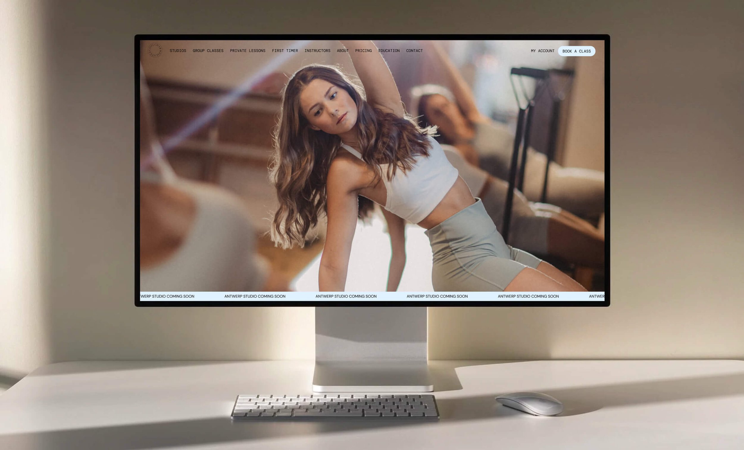
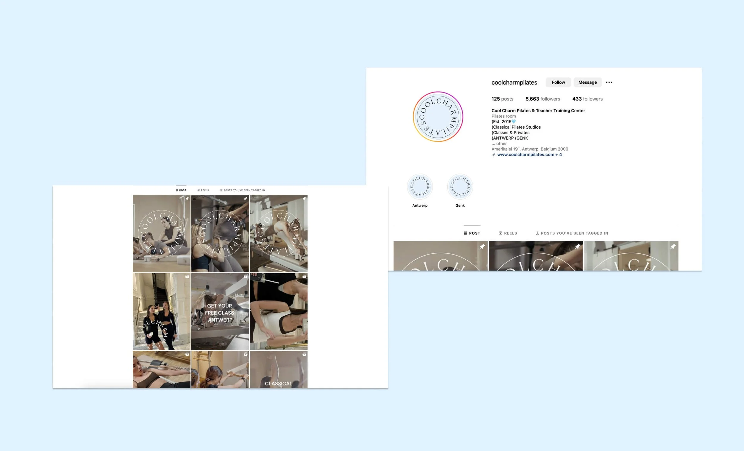
OverviewI worked with Cool Charm Pilates to give their studio a fresh new look. I designed a new logo, created print materials, and built a brand new website. The main goal was to improve their branding and help bring in more clients. Since they opened a second studio, I also made sure the website clearly guides visitors to the right location and makes booking easy.
Freelance project
logoThe logo comes in two versions to balance aesthetics and functionality. The circular Logo is designed for social media and motion graphics, its round shape symbolises flow and movement—key elements of Pilates. The design allows it to rotate smoothly in animations, reinforcing the dynamic nature of the practice. However the horizontal logo is optimised for clarity in practical applications like business cards, studio windows, and signage. This layout enhances readability, ensuring the name stands out in print and large-scale formats. As a unifying detail, the two “o”s in Cool are subtly rotated in both versions, symbolising movement and consistency across the brand.
OutcomeFollowing an in-depth discovery phase and competitor analysis, I developed wireframes that align with both client goals and user needs. The website structure balances essential pages such as Classes, Studios, and Instructors, with tailored experiences like the "First Timer" page, designed to encourage newcomers to book their first reformer Pilates session. The result is a user-friendly experience that supports both engagement and conversion.


